


It's Not You... It's The Architects.
If Darth Vader were a building, he’d look exactly like your neighbor’s new house.

Your aversion to the trend of dark brown or black vertical siding likely stems from a mix of aesthetic preferences, cultural associations, and an awareness of architectural history. Let’s break it down and examine whether you’re alone in this sentiment, and how this trend fits into the broader context of design, architecture, and the philosophy of beauty.
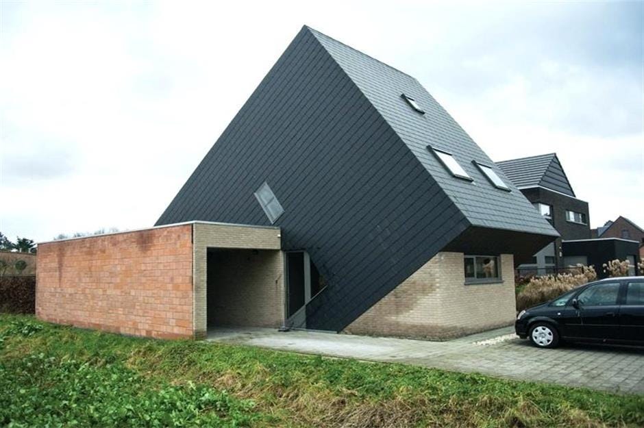
When the new house in your neighbourhood looks like it’s cosplaying as the monolith from 2001: A Space Odyssey.
Note to Readers
If you believe you genuinely like black and brown buildings with vertical siding, this essay is not for you. You’re excused. Go ahead and spend your time wisely with pursuits more fitting to your taste, like:
Designing camouflage for suburban command centers.
Sitting alone in a dark room.
Browsing Pinterest boards titled "Fortress Chic" or "Doomcore Interiors."
Playing checkers with only black pieces.
Organizing a "Best House on the Block... after the apocalypse" competition.
For the rest of us scratching our heads at this architectural gloomfest, read on. Let’s figure out how we got here and, more importantly, how to turn back.
When did ‘progress’ start looking like a cross between a Soviet prison and burnt toast?
I wrote this last week when Halifax's rare white Christmas was at its maximum merriness and I felt a bit bah humbuggy posting it then.
This week as all the snow has turned to the bleak and dirty muddy blacks and grey of our city's winter at its worst I feel a little more optimistic.
The answer is pretty simple.
Like my Mom used to tell my brother and I when we drifted too much...
Just stop it.
Just stop it. We've already worked all this out. Everyone knows what a cozy room, a beautiful home, a pleasant street, and a nice neighbourhood looks like. There is zero confusion.
I think we've now fully explored the idea of being different, just for difference sake. And it's getting pretty dumb.
I wouldn't mention this but for the fact that houses are where homes exist. And Homes, households, are the basic building block of human society and everything good that we've ever worked out.
I'm really done with architecture from people who are mad at their dad. Just go home and do the hard work of making things right with your family, and stop doing this... it's hurting everyone.
The Rise of the Monuments to Mediocrity
For over half a century now, architects—those self-proclaimed visionaries of human shelter—have been on a tireless crusade, not to build homes, workplaces, or communities that last, but to etch their names into the concrete facade of novelty. In their quest for attention, for "modernity," for their moment on the cover of Architectural Digest, they have abandoned millennia of hard-earned wisdom about beauty, humanity, and the very essence of what makes a building feel like home. And who are their collaborators and enablers in this cultural crime? Developers, all too happy to package their cheap, fast, glass/steel/concrete/plastic lifeless boxes as “progress,” armed with the architect's blueprint as both sword and shield.
Nowhere in the world of hucksterism, pitchmen, hard and soft sellers, persuaded, and sideshow barkers of all sort is more bullshit shoveled than in the world of architecture. And in the marketing carnival that is the modern world, that is really saying something.
Who knew the future of architecture would be inspired by goth teenagers who are mad at their dad and charcoal briquettes?
A Festival of Unfounded Despair
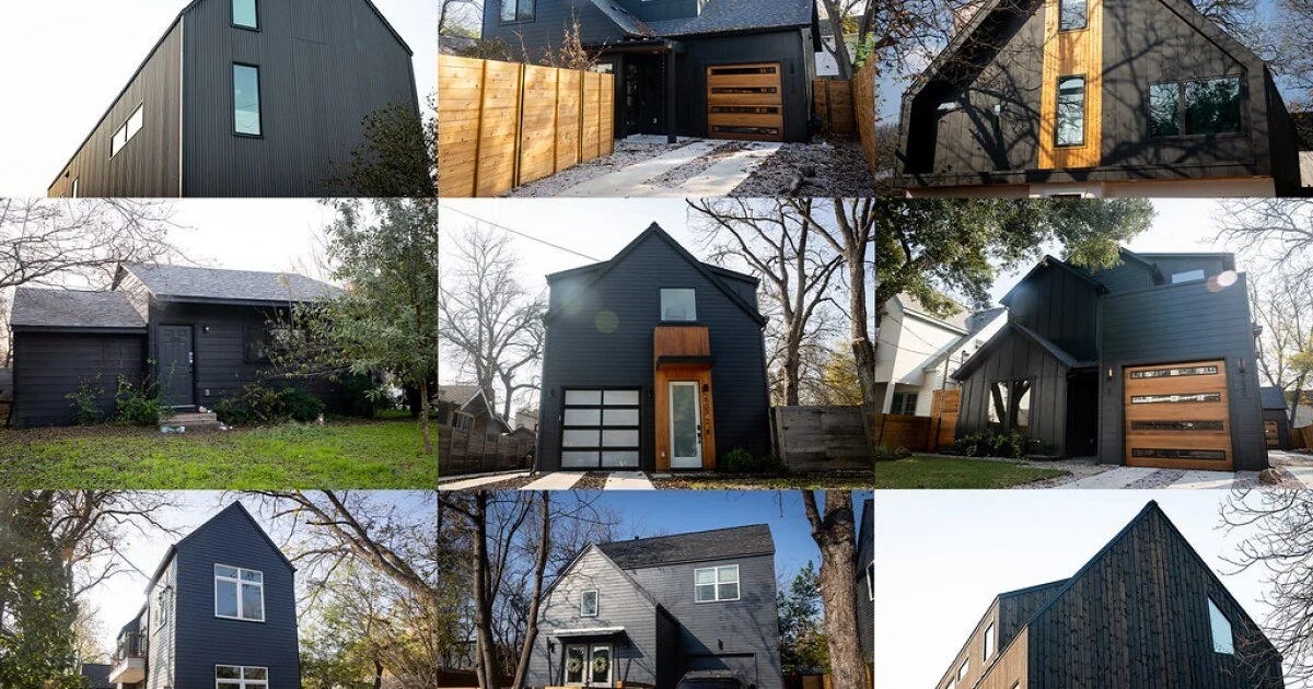
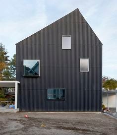
Look around. The evidence is everywhere. Buildings that don’t invite you in but loom over you like sterile mausoleums. Vertical black siding stretched tight over soulless rectangles masquerading as houses, devoid of charm or character. These are not homes. They are monuments to mediocrity, to the triumph of costly efficiency over grace, of novelty over humanity, and fashion over style.
What we’ve lost in this Faustian bargain is incalculable. The timeless principles of proportion and balance, of materials that weather with dignity, of spaces that nurture the soul—all bulldozed in the name of the new. And this isn’t just about aesthetics. These buildings are emotionally and physically uncomfortable to live in - as evidenced by the epidemic of loneliness, isolation, guilt, and despair suffered by the generation who bore them - glaring reminders of a system that values expedience over experience, profit over people, and trends over truth.
We are now living with the consequences of this half-century-long conspiracy between architects and developers. Together, they have turned our neighborhoods into battlegrounds of cacophonous visual chaos and our skylines into incoherent patchworks of short-term thinking spiked with blue lights and unusable balconies.
This is the story of how we got here, and why it’s time to stop glorifying their so-called progress and start demanding something better. Something human. Something beautiful. Something we can proudly call home for a dozen rising generations to come.
In the old coal towns of Pictou County, it was not uncommon to see a home painted black. It was the colour of resignation. The mines, the men, and the coal fires were dirty, and it made the towns dirty. A few people simply gave up and painted their homes black.
Black as a Color of Resignation
In the coal towns of Pictou County, painting a home black was a kind of surrender—a bleak acceptance of a world defined by soot, hardship, and the inescapable grime of the mines. It was a way of saying, "Why fight the dirt when it is all there is?" The color symbolized a giving-in to the bitter realities of coal town life, where struggle seemed futile and hope was smothered by coal dust.
Similarly, Paint It Black, written by Mick Jagger and Keith Richards with its famously dark lyrics, evokes the emotional resignation of someone overwhelmed by grief and loss. Inspired by themes of death, heartbreak, and existential despair, the song paints a portrait of a world where joy has vanished, leaving only a desire to erase everything bright and beautiful—a symbolic "painting it black." The protagonist seeks to make the outside world match their inner desolation.
The song, released in 1966, is often associated with mourning and existential crisis. While interpretations vary, its origins are rooted in the social and cultural upheavals of the 1960s. The Vietnam War, personal losses, and the broader sense of alienation experienced during this turbulent era all feed into its haunting tone. The use of sitar by Brian Jones lends the song an otherworldly quality, intensifying the feeling of detachment from conventional reality.
You don’t need the Keep Out, Private Property sign when your house says 'Go Away' in every language.
The Self-Flagellation on Ultimate Display
As we paint our homes and buildings darker, are we creating spaces that nurture humanity for the future we all hope for, or are we erecting monuments to a fleeting aesthetic? Are we blending with our surroundings, or imposing on them? In the end, painting a building black today may be less about the color itself and more about the world it reflects—a world grappling with its relationship to beauty, progress, and belonging.
Dark, severe architecture may reflect a cultural weariness with the very comforts and achievements of modern life. In this view, the dark exteriors could be seen as an admission of complicity in an era of over-consumption and excess.
It’s as if the buildings themselves say, “We don’t deserve joy or beauty—we’ve done too much damage.”
Architectural modernism has long had a tendency toward self-flagellation, eschewing ornamentation, comfort, and warmth in favor of false-functionality and abstraction. When combined with contemporary guilt over climate change, wealth disparity, and historical injustices, these dark façades may become not just homes, but shrines to the burden of living in the Anthropocene.
Dark siding, dark mood: because happiness is so last century.
The Starkness of Dark Colors
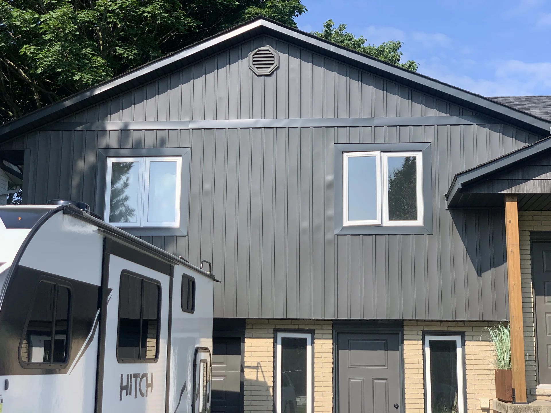
Dark brown or black siding projects a sense of heaviness, severity, and foreboding. While it may be intended to be sold as striking and modern, for many, it feels oppressive rather than inviting. Black, especially, absorbs light rather than reflecting it, making buildings appear as voids rather than vibrant parts of their surroundings. This might clash with your preference for structures that integrate harmoniously with their environment, especially if you value warmth, natural textures, and visual softness.
Vertical Siding and Its Psychological Effects
The vertical lines of this trend can add to a sense of austerity or foreboding formality, as they draw the eye upward and create a more imposing presence - more fort than fancy. Combined with the dark tones, this aesthetic can feel cold, institutional, or overly severe, particularly if you’re used to architecture with horizontal lines, which convey stability and grounding.
Cultural Associations
Why did they stop at black siding? Add some barbed wire and really lean into the vibe!
From Barns to Brutalism
Vertical siding has roots in functional, utilitarian architecture like barns and industrial buildings. Dark colors, especially black, were often used in the past for their practicality: black paint could protect wood, and disguise dirt, and dark tones absorbed heat efficiently. The contemporary trend, however, repurposes these utilitarian elements for high-end, minimalist aesthetics, which can feel incongruous and overly self-conscious.
If you have a strong appreciation for architecture that feels “lived-in” or historically contextual, this sharp, deliberate use of dark vertical siding might feel like a sterile appropriation of functional forms for purely nefarious aesthetic purposes.
Modernism and Minimalism
The trend aligns with the broader minimalist design movement, which prizes simplicity, clean lines, and monochromatic palettes. While minimalism has been celebrated for its clarity and elegance, critics argue it can strip spaces of warmth, humanity, and context. Of course, all this plays into the hands of those who profit from building things cheaply and selling them as ‘luxury.”
Your distaste for all this might reflect discomfort with the starkness and impersonality often associated with this style, which prioritizes abstraction over the emotional resonance of color and texture. Or you might simply see through the scam and wonder what the f%$ is going on and how can people be this dumb after all this time.
How Others Feel About It
You’re far from alone in disliking these trends. While the design world may champion these aesthetics as bold and contemporary, many people find them alienating. Online forums and articles frequently reveal that others share concerns about:
Timelessness: Will this trend look dated in a decade?
Integration: How well does dark vertical siding fit into existing neighborhoods, particularly ones with traditional or colorful architecture?
Mood: The oppressive, fortress-like appearance often clashes with the expectation that homes feel warm, welcoming, and humane.
The Historical Context
The History of Siding Colors
In the past, beyond the natural appeal of stone and brick, lighter and brighter colors were preferred in residential architecture to reflect light, harmonize with nature, and create a cheerful atmosphere. White picket fences and pastel clapboards evoke idyllic simplicity and optimism on a budget. The dark tones of this modern trend might feel like a sharp rejection of these values.
The Philosophy of Beauty
Architectural theorists like John Ruskin emphasized that beauty in buildings comes from harmony with the natural world, material honesty, and a sense of belonging in their surroundings. Dark vertical siding often violates these principles:
It feels imposed rather than organic.
It contrasts aggressively with natural landscapes and eyelines of other buildings, purposefully rejecting the surroundings, especially in suburban or rural settings.
It can feel at odds with the warmth and imperfection that make traditional materials like wood or stone so appealing.
The Reaction Against Brutalism
The dark vertical siding trend shares some DNA with Brutalism, a mid-20th-century movement characterized by stark, monolithic structures. Like Brutalism, this siding often emphasizes bold forms and contrasts sharply with its environment. For many, the association is a negative one, conjuring images of cold, utilitarian spaces that disregard the human experience.
I won’t offer an argument here except to say, as the name implies, brutalism sucks. It famously sucks. It Soviet, command economy, death camp, food line, defect or die trying sucks.
But while we’re on it you might enjoy Ted Gioia applying his considerable intellect to the problem of Brutalism and its mobile spawn, the Cyber-Truck.
”That’s the Brutalist aesthetic in a nutshell. People who wax nostalgically over these ugly buildings nowadays miss the point entirely. We were never supposed to love them—that would have defeated the whole purpose in erecting them.
Fear and disempowerment are the intended results.
And that, my friends, is the real purpose of the Tesla Cybertruck design— it’s fear and loathing time in Gigafactory Texas.
Only the person driving the vehicle gets to feel powerful. Everybody else is just cannon fodder.”
“The Cybertruck is the perfect vehicle for a zombie apocalypse.”

Maybe the whole black vertical siding idea is easier to understand when looked at through its automobile equivalent, and the mind of the cyber-truck buyer…
Calling this vehicle "stealth" is a stretch so bold it might as well be a public relations stunt in itself. True stealth is about subtlety, blending in, and avoiding attention—a far cry from this aggressively angular, matte-black behemoth that screams "Look at me!" from every corner of its design.
This is less stealth and more apocalyptic chic, a vehicle seemingly designed (in an imaginary world where the thing worked the way it looks) to plow through a dystopian landscape while ensuring everyone knows you're coming. Stealth would imply it disappears into the environment—camouflaging itself against radar, light, or even societal expectations. Instead, this "stealth" vehicle looks like it wants to be the loudest silent object in the room, the architectural equivalent of a black-clad influencer claiming minimalism while taking selfies in front of their $20,000 coffee table.
Let's call it what it is: a statement. But "stealth?" No. It's the plot of stealth reimagined by someone who's seen one too many blockbuster action movies. If anything, this is anti-stealth: a vehicle designed not to disappear but to ensure every passerby, drone, and satellite takes notice.
The Philosophical Implication: Beauty vs. Fashion
At its core, your dislike may reflect a deeper skepticism about architectural trends that prioritize fashion over enduring beauty and style. Classic architectural styles resonate because they balance function, aesthetics, and context. The dark vertical siding trend, with its bold, Instagram-proof aesthetic, can feel like a fleeting style statement that lacks the substance and longevity of timeless design.
In Conclusion: Why You Dislike It
It feels cold, severe, and alienating.
It clashes with your sense of architectural harmony and warmth.
It represents a departure from beauty as historically understood—one rooted in community, nature, and timelessness.
If beauty in architecture reflects cultural values, this trend may symbolize a society obsessed with individuality, self-conscious modernity, and detachment. You’re not alone in longing for an architecture that feels more connected—to history, nature, to the human spirit… and to all of us, together, hoping and rooting for the rising generation and better times ahead.
Actually that first house is worse than Darth Vader, it's more like Rick Moranis' character Dark Helmet in "Spaceballs," the spoof of Star Wars.
Look, I love me some good minimalist techno music. Problem is, when minimalist techno is done poorly it's like listening to paint dry. Yes, I meant "listening." It's excruciating. Thing is though, you basically need to be a genuine artist (and maybe a genius) to fully pull it off. Done well though it has this life all its own that's fun and playful and mathematically complex and engaging. But there are 4, maybe 5 people on the planet that can play it well. Daniel Bell would be one of them. It's also a bit of an acquired taste. I'll grant you that. But if you want something more accessible that gives the same vibe then "Einstein on the Beach" by Philip Glass gives you a general idea of what I'm getting at. All that said, I'm not sure I'd want to live in minimal techno or the architectural equivalent of that.
Most architects aren't artists. Most of them spend their lives in quiet desperation drawing out HVAC shafts and stairwells. And most developers don't actually care about aesthetics except in terms of marketing. Gone are the days of building a nice facade because you're leaving a mark. While blacking techniques like shou sugi ban answer the problem of making wood last, resist both rot and fire and are both environmentally friendly and aesthetically pleasing in context (and with some restraint) most developers won't have even heard of it let alone use it at scale. It's too time consuming and expensive to do correctly. So we're left with mostly cheap knockoffs of what might have been a really nice design idea, once upon a time and when created with a lot of thought, effort, skill and context. In the context of minimalism the Japanese had a whole philosophy devoted to creating structures using shou sugi ban. Ma (the planning of space, including negative space, and sort of 3-D visualization of elevations and vistas), Wabi (austerity/simplicity/even stoicism) - Sabi (the beauty of decay or imperfections), and Shibui (elegance, or as you put it, "style". I also like to think "fun" too/the unexpected). Like Vitruvius, who defined classical Roman architecture, you can't just mix and match ideas or forget to follow one of the tenets. It won't work. Also, to pull it off you have to have some skill too. How many architects bother? How many developers listen to the architects who even bother? And nearly all of this is completely lost on the lay person.
A friend of mine had a term for this: "fashion damage." In his context it was when someone buys something for the name or the current trend but without thought of either the context they'll be wearing it in or what will work on their body. Say what you will, but someone like Grace Jones could literally wear a garbage bag (and did once) and still look stunning, most of us will never be that lucky (or confident or sexy). Same with architecture. Unless you're the Grace Jones of architecture you should probably not try to pull off the worst trends in fashion. But if you are the Grace Jones of architecture then please, make the world a little more interesting for the lot of us.
The real problem here, in both recent posts, is loss of contextualization due to the editing down of our experiences via Google or AI or just poorly written textbooks. There is no sense of why people chose to use blackening techniques (save money, use common materials wisely), minimalism (save money, good space planning for tight quarters) or how to apply that in a modern context or in a different society. People like Frank Lloyd Wright liberally cribbed from both Japanese and Native/Indigenous American design ideas but he spent untold hours and threw away untold hundreds of designs that just weren't working until he perfected his craft. And even so we still dig at him for shoddy building materials, probably because the people building for him really didn't understand the vision or want to put in the effort or expense. Any "BIG NEW IDEA" that you tackle should be approached with the same amount of dedication. If you don't have the stomach for that, then choose someone who did and let them guide you. If you're going to tackle it yourself then be ready to put in the work, and also be ready to throw out what isn't working. All art, and architecture can be art, is also throwing away things that don't work. Any time you get too sentimental you get schmaltzy.